# Text field
[Text fields](https://material.io/components/text-fields) let users enter and edit text.
For more information, see the [API](#api) documentation.
The text field class consists of the following types:
* [Filled text](#filled-text)
* [Outlined text](#outlined-text)
## Using text fields
Text fields allow users to enter text into a UI. They typically appear in forms and dialogs.
### Installation
```
npm install @material/textfield
```
### Styles
```scss
@use "@material/floating-label/mdc-floating-label";
@use "@material/line-ripple/mdc-line-ripple";
@use "@material/notched-outline/mdc-notched-outline";
@use "@material/textfield";
@include textfield.core-styles;
```
### JavaScript instantiation
```js
import {MDCTextField} from '@material/textfield';
const textField = new MDCTextField(document.querySelector('.mdc-text-field'));
```
**Note: See [Importing the JS component](../../docs/importing-js.md) for more information on how to import JavaScript.**
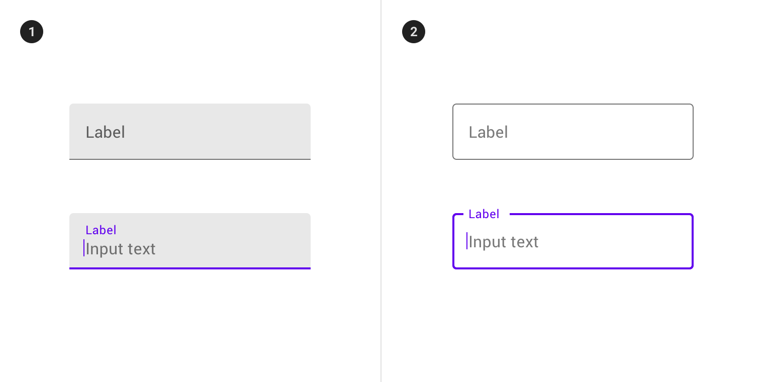
## Filled text
[Filled text fields](https://material.io/components/text-fields/#filled-text-field) have more visual emphasis than outlined text fields, making them stand out when surrounded by other content and components.
### Filled text example
```html
```
## Outlined text
[Outlined text fields](https://material.io/components/text-fields/#outlined-text-field) have less visual emphasis than filled text fields. When they appear in places like forms, where many text fields are placed together, their reduced emphasis helps simplify the layout.
### Outlined text example
```html
```
See [here](../mdc-notched-outline/) for more information on using the notched outline sub-component.
**Note: Do not use `mdc-line-ripple` inside of `mdc-text-field` _if you plan on using `mdc-text-field--outlined`_. Line Ripple should not be included as part of the DOM structure of an outlined text field.**
## Other variations
### Textarea
#### Filled
```html
```
#### Outlined
```html
```
**Note: The `mdc-text-field__resizer` element may be omitted for a non-resizable textarea.**
### Text field without label
A text field doesn’t require a label if a separate but clear label indicator is already displayed adjacent to the text field.
Add class name `mdc-text-field--no-label` and remove the label element from the structure.
#### Filled
```html
```
#### Outlined
```html
```
#### Textarea
```html
```
### Disabled text field
To disable the text field, add the `disabled` attribute to the `` element and add the `mdc-text-field--disabled` class to the `mdc-text-field` element.
```html
```
### Text field with helper text
The helper text provides supplemental information and/or validation messages to users. It appears on input field focus
and disappears on input field blur by default, or it can be persistent. Helper text should be rendered inside `.mdc-text-field-helper-line` element
which is immediate sibling of `.mdc-text-field`. See [here](helper-text/) for more information on using helper text.
```html
helper text
```
### Text field with character counter
Character counter is used if there is a character limit. It displays the ratio of characters used and the total character limit.
Character counter should be rendered inside `.mdc-text-field-helper-line` element which is immediate sibling of `.mdc-text-field`.
See [here](character-counter/) for more information on using character counter.
```html
0 / 10
```
### Multi-line text field (textarea) with character counter
A character counter can be associated with a textarea by including it in the
helper line. In this case, the counter will appear below the textarea, adjacent
to any helper text.
```html
0 / 140
```
Alternatively, the character counter can be placed in the textarea's body by
inserting the character counter below the textarea and adding the
`mdc-text-field--with-internal-counter` modifier class to the text field.
```html
```
Helper text and Character counter are optional subcomponents of text field that can co-exist independently.
It is recommended that `.mdc-text-field` and `.mdc-text-field-helper-line` elements have same width for correct layout.
### Text field with prefix and suffix text
Prefix and suffix text can add context to a text field, such as a currency symbol prefix or a unit of mass suffix.
A prefix, suffix, or both can be added within the default or outlined variants of text fields.
```html
```
**Note: Do not use `mdc-text-field--affix` within `mdc-text-field--textarea`.**
### Text field with leading and trailing icons
Leading and trailing icons can be added within the default or outlined variant of MDC Text Field as visual indicators as
well as interaction targets. See [here](icon/) for more information on using icons.
## Other features
### HTML5 validation
`MDCTextFieldFoundation` provides validity styling by using the `:invalid` and `:required` attributes provided
by HTML5's form validation API.
```html
```
`MDCTextFieldFoundation` automatically appends an asterisk to the label text if the required attribute is set.
### Pre-filled
When dealing with JS-driven text fields that already have values, you'll want to ensure that you
render `mdc-text-field` with the `mdc-text-field--label-floating` modifier class, as well as
`mdc-floating-label` with the `mdc-floating-label--float-above` modifier class. This will
ensure that the label moves out of the way of the text field's value and prevents a Flash Of
Un-styled Content (**FOUC**).
```html
```
### Baseline alignment
By default, text fields will be aligned with other elements relative to their
baseline. The input text's baseline is used to determine where a text field
should be aligned to and is different between variants. To force alignment to
the text field's container instead of its baseline, align the element using
flexbox.
```html
Text that is aligned with the text field's value
Text that is aligned to the bottom of the text field's outline
```
## API
### CSS classes
CSS Class | Description
--- | ---
`mdc-text-field` | Mandatory.
`mdc-text-field--filled` | Styles the text field as a filled text field.
`mdc-text-field--outlined` | Styles the text field as an outlined text field.
`mdc-text-field--textarea` | Indicates the text field is a `
 ## Using text fields
Text fields allow users to enter text into a UI. They typically appear in forms and dialogs.
### Installation
```
npm install @material/textfield
```
### Styles
```scss
@use "@material/floating-label/mdc-floating-label";
@use "@material/line-ripple/mdc-line-ripple";
@use "@material/notched-outline/mdc-notched-outline";
@use "@material/textfield";
@include textfield.core-styles;
```
### JavaScript instantiation
```js
import {MDCTextField} from '@material/textfield';
const textField = new MDCTextField(document.querySelector('.mdc-text-field'));
```
**Note: See [Importing the JS component](../../docs/importing-js.md) for more information on how to import JavaScript.**
## Filled text
[Filled text fields](https://material.io/components/text-fields/#filled-text-field) have more visual emphasis than outlined text fields, making them stand out when surrounded by other content and components.
### Filled text example
```html
```
## Outlined text
[Outlined text fields](https://material.io/components/text-fields/#outlined-text-field) have less visual emphasis than filled text fields. When they appear in places like forms, where many text fields are placed together, their reduced emphasis helps simplify the layout.
### Outlined text example
```html
```
See [here](../mdc-notched-outline/) for more information on using the notched outline sub-component.
**Note: Do not use `mdc-line-ripple` inside of `mdc-text-field` _if you plan on using `mdc-text-field--outlined`_. Line Ripple should not be included as part of the DOM structure of an outlined text field.**
## Other variations
### Textarea
#### Filled
```html
```
#### Outlined
```html
```
**Note: The `mdc-text-field__resizer` element may be omitted for a non-resizable textarea.**
### Text field without label
A text field doesn’t require a label if a separate but clear label indicator is already displayed adjacent to the text field.
Add class name `mdc-text-field--no-label` and remove the label element from the structure.
#### Filled
```html
```
#### Outlined
```html
```
#### Textarea
```html
```
### Disabled text field
To disable the text field, add the `disabled` attribute to the `` element and add the `mdc-text-field--disabled` class to the `mdc-text-field` element.
```html
```
### Text field with helper text
The helper text provides supplemental information and/or validation messages to users. It appears on input field focus
and disappears on input field blur by default, or it can be persistent. Helper text should be rendered inside `.mdc-text-field-helper-line` element
which is immediate sibling of `.mdc-text-field`. See [here](helper-text/) for more information on using helper text.
```html
## Using text fields
Text fields allow users to enter text into a UI. They typically appear in forms and dialogs.
### Installation
```
npm install @material/textfield
```
### Styles
```scss
@use "@material/floating-label/mdc-floating-label";
@use "@material/line-ripple/mdc-line-ripple";
@use "@material/notched-outline/mdc-notched-outline";
@use "@material/textfield";
@include textfield.core-styles;
```
### JavaScript instantiation
```js
import {MDCTextField} from '@material/textfield';
const textField = new MDCTextField(document.querySelector('.mdc-text-field'));
```
**Note: See [Importing the JS component](../../docs/importing-js.md) for more information on how to import JavaScript.**
## Filled text
[Filled text fields](https://material.io/components/text-fields/#filled-text-field) have more visual emphasis than outlined text fields, making them stand out when surrounded by other content and components.
### Filled text example
```html
```
## Outlined text
[Outlined text fields](https://material.io/components/text-fields/#outlined-text-field) have less visual emphasis than filled text fields. When they appear in places like forms, where many text fields are placed together, their reduced emphasis helps simplify the layout.
### Outlined text example
```html
```
See [here](../mdc-notched-outline/) for more information on using the notched outline sub-component.
**Note: Do not use `mdc-line-ripple` inside of `mdc-text-field` _if you plan on using `mdc-text-field--outlined`_. Line Ripple should not be included as part of the DOM structure of an outlined text field.**
## Other variations
### Textarea
#### Filled
```html
```
#### Outlined
```html
```
**Note: The `mdc-text-field__resizer` element may be omitted for a non-resizable textarea.**
### Text field without label
A text field doesn’t require a label if a separate but clear label indicator is already displayed adjacent to the text field.
Add class name `mdc-text-field--no-label` and remove the label element from the structure.
#### Filled
```html
```
#### Outlined
```html
```
#### Textarea
```html
```
### Disabled text field
To disable the text field, add the `disabled` attribute to the `` element and add the `mdc-text-field--disabled` class to the `mdc-text-field` element.
```html
```
### Text field with helper text
The helper text provides supplemental information and/or validation messages to users. It appears on input field focus
and disappears on input field blur by default, or it can be persistent. Helper text should be rendered inside `.mdc-text-field-helper-line` element
which is immediate sibling of `.mdc-text-field`. See [here](helper-text/) for more information on using helper text.
```html